visualizing our nation's political landscape
This is nothing new, but it's certainly still interesting.
Since election day, there have been a number of attempts to rationalize and visualize the policial landscape of our country. I've been pointed to a number of useful visualizations which are worth noting:
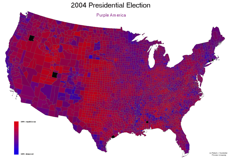
this map loses the "red/blue state" menality and shows just exactly how each part of the country voted, to the highest resolution possible. It was created by Robert J. Vanderbei using information publically availible through USA Today and the US Census's Tiger Database. Click on the image for more details as well as variants on the map.
Another interesting technique is to weigh the political map by population density. There have been two different approaches which have caught my eye:

The first is this cartogram approach which actually distorts the map to make area match population. This graphic was made by Suresh Venkatasubramanian.
The second is the "dotty" approach by the New York Times. They don't have a screen shot imeediately availible, but you can view their visualization via this plug-in
![]()

No comments:
Post a Comment
Note: Only a member of this blog may post a comment.